After the 1973 whirlwind of publishing several of his own books, completing multiple illustration projects for other authors and tackling the theater designs for Dracula in Nantucket, Edward Gorey did not publish any new books again until 1975 (Categor y was published in 1974, but only because of printing delays - Mr. Gorey's involvement with the project was completed in time for the original publication date in 1973). This might lead one to believe that Mr. Gorey was taking some time off or went traveling after such a busy time, but that is something he never did!
For the first time since his show at the Mandrake Bookstore in the early 1950's (see my posting from October 10, 2008), Edward Gorey was preparing new pieces for a gallery exhibition which was being organized by The Graham Gallery in Manhattan. Mr. Gorey created 46 original pieces of art for the exhibition, entitled Plain & Coloured Drawings by Edward Gorey. In an interview from 1977, Mr. Gorey stated that since his early days as an artist up to the time of the Graham show he rarely, if ever, created art without a purpose (commission work, or for one of his own books), so this exhibition was a unique experience for him, and a rare treat for his admirers.
A four page gallery booklet was created showing five of the pieces that were in the exhibition. The booklet included a short essay by Brendan Gill about Mr. Gorey's work. I have a two page mimeographed checklist from the gallery which lists the titles of the pieces included in the show - I am not sure if this checklist was something that was created for gallery use only or was given to prospective buyers. My copy of the booklet is signed and inscribed by Mr. Gorey. The art in the exhibition was available for purchase. At this stage in his career Mr. Gorey rarely sold original art, so having an opportunity to view and purchase pieces was a special opportunity. The show was successful enough that Graham featured Mr. Gorey again in 1975.
The titles of the pieces (from the checklist) shown at the gallery were:
1. Trying to feed the baby to the dog
2. Two children on a rock (in my collection)
3. Cell
4. Chinese life
5. Dancing on the Sabbath (pictured in booklet, shown above)
6. Animals and wall
7. China design: picnic
8. Birds and car
9. Animals and train (pictured in booklet, shown below)
10. Ballet dancer on skull
11. Football player with skull (pictured in booklet, shown above)
12. Bathroom wallpaper design
13. Animals and urn
14. After a Staffordshire sugarbowl
15. Child on swing
16. The white butterfly
17. A dull afternoon
18. Platter design
19. Man and floating skull
20. Unpleasant fan design
21. Blue urns (in my collection)
22. Plain & Coloured Drawings (cover of booklet, shown at top of post)
23. Verso: Plain & Coloured Drawings (rear cover of booklet, shown below)
24. Discrete self-portrait
25. Tennis
26. Animal going to a party
27. Animal holding banner
28. String dance I - IIII
29. Cat on cardboard rocks
30. Cat with umbrella and flower
31. Cat wearing long scarf
32. Cat inside empty picture frame
33. Cat drawing wallpaper
34. Cat between andirons
35. Cat on mantelpiece
36. Cat in portable niche
37. Cat at the devil's thimble
38. Masked cat behind pillar
39. Masked cat dancing beside pool
40. Cat at the corner of a carpet
41. Cat composing a poem
42. Cat appearing between parting clouds
43. Cat ascending on a piece of stage machinery
44. Ninety nine puppies wearing orange knitted caps
45. Waxworks
46. Peas
Apart from the five pieces reproduced in the booklet and two pieces in my collection, I have not seen any art from this show. I assume that the pieces were sold and are in collections as opposed to being lodged in the estate archives since I have never heard of any of the images from this show being exhibited or reproduced since their debut in 1974. I would love to see more of the pieces from the list above. I will be showing the two pieces of art I own in later postings.
Tuesday, June 30, 2009
Saturday, June 27, 2009
More B. Altman Advertising
The second piece of original artwork in my collection from the B. Altman advertising campaign is another unusual image by Edward Gorey. This ad is promoting a special consignment of rugs which have been imported by Altman's by their rug department.
For this ad, Mr. Gorey has drawn a rather bemused camel with a rider. Apart from his eyes, the rider is completely shrouded in his travel robes. Even though he is really just a mass of fabric atop the camel, Mr. Gorey has shown his skill in rendering an instantly recognizable human figure beneath the cloth. The rug shown in the ad is not part of the artwork, but was a photo of a rug added by the art director. As with the other advertisements from this series, this full page ad is overloaded with blocks of type and rather poorly designed.
Wednesday, June 24, 2009
B. Altman Advertising Campaign
Creating ads to be used in magazines or newspapers was something which Edward Gorey was rarely commissioned to undertake. There are ads which use Gorey images from books he wrote or illustrated, but he only occasionally created artwork specifically to be used as an advertisement.
In 1974, B. Altman & Co. of New York City launched an extensive print ad campaign and hired Edward Gorey to provide illustrations for these ads. I am not sure how many of these full page ads were created because there are no records apart from the ads themselves in magazines, but I know of nine separate ads that appeared with Gorey art.
Altman's was an old world department store, the likes of which have disappeared today (Altman's closed many years ago). They had permanent departments for everything from the usual clothing, bridal, glass and china to the unexpected; which included a rare book department, fine antiques, imported goods, gourmet foods (before this was the norm in department stores), and fine art. It was a store that prided itself on having unusual, unique items. Their holiday displays were extensive, and Bill and I have two wonderful sets of miniature glass Christmas ornaments that we purchased on a visit in the early 1980's and brought back to Minnesota on the plane!
Due to the rather strange look of the ads, I can only assume that Edward Gorey had little or no input in the actual art direction. He appears to have simply been commissioned to provide spot illustrations which were dropped in alongside the wordy type blocks and photos of goods being promoted. The resulting ads, in my opinion, were not very appealing visually.
The drawings used for the ads, however are lovely vignettes and character studies. I own two pieces of original art from this series. The first is an image of a man decorating pottery. As you can see when you compare the scan of the original artwork (below) with the printed ad (upper left corner in the photo to the right), the image was severely cropped for the ad. The ad promoting decorative planters was also cropped for publication (lower left corner of the photo to the right).
The drawing of the Chinese gentleman is wonderfully rendered, and is far more interesting as drawn than it is in the ad itself. The art director removed the large Chinese vase and table and replaced it with a photo of a teapot, creating an awkward image. On the piece of art, the detail of the painter's toes against the table leg is a naturalistic touch, even if the way he is holding his paint brush is rather odd!
I will show the ninth ad and my other, equally unusual "Gorey/Altman" original in the next posting.
Sunday, June 21, 2009
A Pair of Fragile Items
As I wind up 1973, I have a couple very fragile items to show. The first is Jack the Giant Killer, published by Scholastic Books (the same publisher of the American printings of the Harry Potter series today). This small accordion fold pamphlet is only 2.5" x 3.5". Because the paper used is very thin, this item is easily damaged. The copy I am showing has been signed by Mr. Gorey.
Around this time, Edward Gorey appears to have illustrated a small handful of fairy tales. Starting in 1972 with Red Riding Hood (authored by Beatrice de Regniers and published by Antheneum), and followed by Jack the Giant Killer (no author credited), and Rumpelstiltskin (also Scholastic, authored by Edith H. Tarcov).
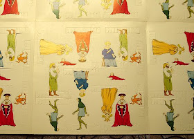
To accompany Rumpelstiltskin, Scholastic published the extremely fragile Lucky Little People. This fold out sheet contains several sets of cut-out finger puppets which can be punched out and turned into toys. The folded card of cut-outs is quite large and is protected by a single folded sheet of paper on which the title and printed instructions appear. The instruction sheet claims that this is to be set #1 of a series, but no other cut-outs were produced, and this appears to be the end of Edward Gorey-illustrated fairy tales for children.
Sunday, June 14, 2009
Dracula Original Art
One of the cornerstone pieces of original artwork by Edward Gorey in my collection is the drawing for the proscenium arch from the Nantucket production of Dracula. This piece of art is inscribed "To John", and is signed by Mr. Gorey. It was presented to producer John Wulp by the artist and came from his personal collection. This is the only piece of Dracula original art in my collection and it represents the earliest association with this play by Mr. Gorey.
The drawing features one of Mr. Gorey's signature "Skull-Headed Bats" hovering above the stage, with skull shaped planters on either side of the stage. The planters are placed in front of massive castle walls, which were used throughout the set for Dracula. Growing out of these planters are evil looking flowering plants.
Because this piece of art was used as a working drawing by the scenic technicians, it was drawn at 1/4 scale for the stage, as was all the art for this production. Mr. Gorey stated in an interview that he had to draw the sets at quarter scale (which is smaller than usual for set designs) because if he made the art larger and filled the designs with the intended crosshatching, it would have taken forever for the scenic artists to hand paint the details when enlarged to full size for the set! As you can see from the photo of the set, every surface of the set is covered in Mr. Gorey's trademark crosshatching, so even with these larger strokes, painting the set still took considerable time and effort to complete.
Thursday, June 11, 2009
Dracula in Nantucket
There once was a vampire in Nantucket...
The summer of 1973 saw the first staged production of Dracula with sets and costumes by Edward Gorey. Produced by John Wulp at the Cyrus Peirce Theatre in Nantucket, the play was directed by Dennis Rosa and starred Lloyd Battista as Count Dracula.
At the suggestion of a mutual friend, producer John Wulp telephoned Edward Gorey to see if he would design a stage production of Dracula. After a few meetings to discuss the piece and work out the physical requirements of the staging, Mr. Gorey went off on his own and began to think and draw. The resulting stage sets were a masterpiece of innovation and detail. To give the production a singular look, Mr. Gorey was also commissioned to design the costumes.
It has been quoted by Edward Gorey (and others, including Mr. Wulp) that EG was not a great collaborator. If you wanted Mr. Gorey to undertake a project and he agreed to do it, he would discuss it, then go off and do what he thought best to complete the assignment.
Given the freedom to adapt and invent, it was Edward Gorey who came up with the idea that the set would use a basic framework with five arches which would encircle the stage area. Within the openings of these arches would be changeable panels for each of the three acts of the play. The main structure of the stage would not change, but through the panels and set pieces the stage would be transformed into three completely different settings. This effective and economical set design gave the play an atmosphere that was both unnerving and slightly mad - a perfect fit for the play.
A wealth of "Gorey details" were incorporated into the sets that included bat motifs which surrounded the actors and were continued in some of the costume designs. The photos from the Nantucket production which I am showing are, unfortunately, not in my personal collection. I am looking for a set of these (or any other) original photographs from this production.
Greeting theater goers when they arrived for this exciting night of Victorian melodrama was a fantastic drop curtain, showing the title character luring Miss Lucy towards her impending doom. This 8" x 10" photograph of the original drop curtain art is in my collection. This drawing was reproduced inside the program along with sketches for each of Lucy's three costumes (one costume for each act).
This regional production was such a success that talk of moving the show to Broadway quickly ensued. More on the Broadway production in a later posting.
Monday, June 8, 2009
The Black Doll
The Black Doll is the only "'A' Collection" book by Edward Gorey that was published without illustrations. Densely written as a silent film script, this is perhaps the only written record by Mr. Gorey of what he was actually seeing "in his mind's eye" as he mapped out a story. If translated into his standard illustrated book form, the title cards would be the text and we are left to imagine the pictures he would have drawn by the descriptions of the scenes. The plot for this piece begins in an apparently straightforward manner, but soon descends into confusing twists and turns which characterize much of Mr. Gorey's work.
This is not the first appearance of the Black Doll. The armless figure first appears in Mr. Gorey's second book, The Listing Attic accompanied by one of the texts in French. The back cover of The Willowdale Handcar, or the Return of the Black Doll also features this enigmatic stuffed object (even though it does not appear in the story).
Gotham Book Mart published the first edition of this book in 1973, and it was reprinted in its entirety in Scenario, The Magazine of Screenwriting Art in 1998. The Black Doll has remained a "Gorey Rarity" until this past year when it was reissued by Pomegranate Books. The original edition was published in wrappers with a black dust jacket adorned by a small pasted on illustration. The illustrated paste-up on the cover is the same format used on Categor y, and was perhaps going to be the visual signature of Gotham-produced Gorey books. My copy of this title is signed and inscribed to me by Mr. Gorey.
The signed, limited edition of The Black Doll was bound in boards (with the paste-up) and housed in a plain slipcase (again like Categor y). The book is limited to 100 numbered/signed copies and 26 A-Z lettered/signed copies. I am showing copy #26/100.
When Scenario printed the script for this unproduced film, Edward Gorey provided a handful of new character/costume illustrations to accompany the text. The magazine also interviewed Mr. Gorey about the script. The interview was reprinted in Ascending Peculiarity, published in 2001. This issue of Scenario also includes the complete screenplays for The Full Monty, Young Frankenstein, and The Spanish Prisoner. Interviews with the screenwriters accompany each script.
In April 2009, Pomegranate published a new, hardcover version of The Black Doll with an illustrated dust jacket. Included in this volume are the illustrations and interview from Scenario. Also included is a new introduction by Andreas Brown.
Thursday, June 4, 2009
Dracula
Edward Gorey. Dracula. A Perfect Pairing.
Edward Gorey claimed to have read Bram Stoker's 1897 classic, Dracula at age 7. Master Edward showed remarkable stamina in his literary choices for one so young. Structured as a series of journal entries and letters between characters, Dracula can be difficult for many adults to work their way through.
Mr. Stoker (pictured to the right) died in 1912. In 1924, his widow authorized an adaptation of Dracula to be turned into a London stage play. By 1927, this stage adaptation opened on Broadway with Bela Lugosi portraying Count Dracula and Edward Van Sloan as Professor Van Helsing. Most people are familiar with the 1931 Universal Studios movie, in which Lugosi and Van Sloan reprised their signature roles. There was a 1922 German expressionist silent film titled Nosferatu directed by F. W. Murnau and staring Max Schreck which was based on Stoker's novel, but this was an unauthorized adaptation.
In 1973, producer John Wulp engaged Edward Gorey to create the sets and costumes for a re-staging of the 1924 play in a production by the Nantucket Stage Company. The summer of 1973 saw the first staged production of the Gorey-designed Dracula on stage. This production began a saga that would lead Mr. Gorey to Broadway, a Tony Award, several books (both finished and unfinished), and a slew of Gorey-designed Dracula collectible items.
Dracula was not Edward Gorey's first work on the stage, but his involvement with this production was so singular that, in the program the production is titled The Edward Gorey Production of Dracula. Every visual element of the production, from the proscenium and drop curtain, to the sets, furniture and costumes was designed by Mr. Gorey. Inside the program are photos of several finished drawings and sketches by Mr. Gorey, but the cover was (obviously) drawn by someone at the theatre. The program I am showing is signed by Mr. Gorey.
More Dracula to come...
Monday, June 1, 2009
Categor y
1973 was such a busy year for Edward Gorey, that Categor y had to have been intended as an "easy" project. Using the 50 cat drawings he created for the limited edition of Amphigorey (see my post from April 15, 2009), Mr. Gorey did not have to create any new artwork for this volume apart from the title page and cover paste-up. Production problems resulted in the book not being published until 1974. As with many things in life, often the projects that should be easy take more time than others.
Categor y was published by The Gotham Book Mart in a signed, limited edition of 100 numbered and 26 lettered copies. These copies were bound in hardback and issued in a specially made slipcase. At the top of the posting I am showing book #72/100 from this edition.
The first trade edition was also published by The Gotham Book Mart in grey/blue wrappers with a pasted label on the front. My copy is signed by Mr. Gorey on the title page.
Categor y appears to be a favorite title for reprints, even though it has no text and consists of numbered drawings of cats. This title appears in Amphigorey Again and has been reprinted as an individual book a few times, first as a hard cover book (white laminated boards, no DJ, shown at left) by Adama, which is the worst printing of this title - the colors are way off and the quality of the printing is really bad.
Categor y has become available recently from Pomegranate as a hardcover in illustrated dust wrapper. The Pomegranate printing is a nicely produced edition, and is shown to the left.