The June 24th Illustration Art Auction at Swann Galleries in NYC offered a spectacular selection of original illustration artwork by Edward Gorey. Perhaps the most unusual offering was the suite of art created for the book All Strange Away by Samuel Beckett.
All Strange Away (ASA) has been published many times over the years, with the first translation in English printed in 1964. In 1976 Andreas Brown chose to publish the story under his Gotham Book Mart imprint and commissioned Edward Gorey to illustrate the volume. Mr. Gorey is on record as stating that he did not collaborate with authors whose work he illustrated and ASA is an object lesson in how to publish a beautifully produced book with virtually no collaboration between any of the parties involved.
Orchestrated by Mr. Brown, the text was pre-existing, so permission to publish the story was acquired through Mr. Beckett's literary agent. Mr. Gorey was sent the text and created 16 images which were sent directly to Ronald Gordon at The Oliphant Press where the book was being created. Mr. Gorey did not specify how or in what order the images were to be used. Mr. Gordon read the text, looked at the artwork, and decided what the book would look like and how the illustrations would appear in the volume without input from any of the other parties. This creative detachment was eminently appropriate to the author, illustrator, and subject matter of the book.
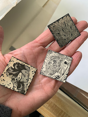
Edward Gorey created a suite of 16 illustrations for ASA that are neither drawings nor collage but bear the hallmarks of both. Obtaining an old book with engraved illustrations, Mr. Gorey searched for images, zeroing in and cutting out 1.25" squares from the pages of the book. He then modified each image by hand, adding pen & ink shading and line work to enhance or change each postage stamp sized picture. The images were then carefully pasted down on three boards and sent to the publisher. Apart from indicating the top on each page, there were no notations to guide Mr. Gordon as to which illustration was intended for any specific part of the story. The final positioning of the images on the pages resembles an illustrated manuscript. For the cover of the book, a cropped portion of one of the images (shown above) was enlarged and printed in negative, transforming the image to look like a block print.Considering the way these images were created, one could take the position that there was a second (unknown) illustrator who unwittingly collaborated on the illustrations for the book, but once again had no direct contact with anyone else involved. In the 1990's Edward Gorey embraced the use of clip art images in a series of postcards and broadsides using collage techniques but these later pieces did not include image modification.Like many other illustrators, over the course of his career Edward Gorey freely employed paste-up techniques to "fix" his drawings. It was Mr. Gorey's common practice to glue pieces of paper onto the surface of his artwork so he could modify a drawing or change a title without redrawing the entire image. Unfortunately, when making these revisions Mr. Gorey often used a very unstable glue that quickly became brittle, turned brown, and let go of the pasted correction. He used this glue was used to affix the ASA images to the backing boards. When the art arrived at Swann only two squares remained affixed in their original positions.
To photograph the art for auction, illustration specialist Christine Von Der Linn had to match the imprint of the discolored glue on the boards with the reverse image on the art pieces to indicate their proper positions and orientation. Permanently remounting the art to the boards has been left to the discretion of the collector who purchased this suite of artwork.
The original artwork discussed in the post is not in my personal collection. The limited edition book pictured was sold previously at Swann. All images have been provided by Christine Von Der Linn and Swann Galleries and are used with permission.


