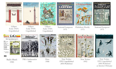
As discussed in the previous post, over the course of his career Edward Gorey created a total of 34 published magazine covers. Only 8 of the 34 covers were conceived as full color paintings, the rest being black and white drawings that sometimes had some color dropped in, or colored backgrounds added.
In addition to the eight published color covers, there are also four unpublished full color designs.
The playful May 1975 Publishers Weekly
cover is the boldest full color cover of the 1970's. With this cover,
Edward Gorey hearkens back to his work for Anchor Publishing, and creates
an illustration that incorporates all aspects of the magazine cover into a singular image. The
masthead, logo, and typeface are reflected both in color and style on the
wings of the flying figure, and the overall layout is conceived as a single Gorey-designed piece. The use of small speech bubbles would be more appropriate for an interior illustration than a cover image, but the design has a strong graphic sensibility.
The June 1975 issue of National Lampoon has a better conceived cover image than the December 1971 Lampoon cover, but it still does not take full advantage of its prominent position. While Edward Gorey rarely used speech bubbles in his own work, he cannot seem to leave them off his color cover designs. Interestingly, the use of speech bubbles does not appear on any of his black and white magazine cover designs (see previous post for images).
1983's cover illustration for Radio Shack's Hot Coco magazine looks even more like a panel cartoon than the National Lampoon covers. This is mainly due to the artwork's placement on the cover, and the large speech bubble. With an Edwardian family discussing the
merits of a color computer (CoCo stands for Color Computer), the image is colorful and humorous, but the layout of cover as a whole is pedestrian and unimaginative. The image itself is expertly rendered with painted details intermingling with line work to create different textures and surfaces. The use of color in this piece is subtle and quite beautiful.
Edward Gorey finally comes into his own with the June 1984 TWA Ambassador Magazine color cover. Titled The Insomniac's Garden,
this piece is one of several "fantasy garden" images created by different
artists that are featured within this issue. The drawing has been designed by Mr. Gorey as a complete concept, with room for the
masthead and typography accommodated within the illustration. The design is bold, eye catching, and completely visual. Gone are the cartoon caption bubbles, leaving the viewer free to muse on the image. The piece is a subtle study in grey tones, with the occasional pinpoint of color to draw the eye.
In 1992 Edward Gorey submitted two full color pieces to The New Yorker for consideration, one of which was published as the cover of the December 1992 holiday issue. Papering the Tree would be the last color magazine cover by Mr. Gorey published during
his lifetime. Once again, the artist has created a colorful, stimulating image that is full of humor. Instead of wrapping presents to put under the tree, this extended family is wrapping the tree itself - and the cat & dog.
Submitted to The New Yorker magazine in 1992 along with Wrapping The Tree, Cat Fancy was set aside by the editors to be virtually forgotten. Rediscovered many years after Edward Gorey's death, this masterpiece work would finally appear on the cover of the December 2018 holiday issue. Layers upon layers of fabric, pillows, dust ruffles, and duvets adorn an overstuffed bed whose inhabitants are a pair of reclining cats.
Unpublished Cover Designs
Finally, along with the three Lilliput images from the 1950's, a fourth unused full color cover design was created by Edward Gorey in 1993. Flappers and Topiary is an imaginative image that, like Cat Fancy, was set aside by the staff at The New Yorker when it was submitted to the magazine in 1993. This image has yet to appear on the magazine's cover, but it was published as a full page memorial in the magazine shortly after Mr. Gorey's death.
Cover images provided by Irwin Terry, Sam Spiegel, Swann Auction Galleries, Internet Search


No comments:
Post a Comment