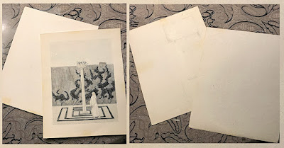
As discussed in a previous post, Edward Gorey created 34 magazine/periodical cover designs over the course of his career. Mr. Gorey's cover for the June 1984 issue of TWA's Ambassador Magazine is titled The Insomniac's Garden. Several artists contributed artwork for the feature "Gardens You Never Dreamed Of" inside this issue.
The Insomniac's Garden is a study in grey tones, and the overall coloration suggests that the garden might be located in northern Sweden where the sun never completely sets during the month of June (the month this magazine was issued). Since Ambassador is an airline magazine whose goal is to promote international travel, it is a witty commentary on travel by Edward Gorey, a man who only traveled outside the United States once in his life.
A pale midnight sun hangs in a washed grey sky over a garden surrounded by a high wall along which unkept topiary runs rampant. A sleeping cat lies on top of the wall, undisturbed by the perpetual twilight. A single tall column topped with an urn rises from the center of a garden maze that has either been recently planted or is stunted.
A solitary woman in a long nightshirt wanders forlornly within the maze, her gaze distracted, her steps faltering. Our fretful insomniac lives in this nightless world where all colors are reduced to one tone. The only non-grey color in the piece is the woman's skin and the pink ears and red eyes of her bunny slippers. These pink tones are mimicked in the line of type at the top of the cover.
At 8.5" x 11" (image size on larger board), this is a large color painting for Edward Gorey. The layout is quite sophisticated and showcases Mr. Gorey's consummate skill as a graphic artist. The piece was carefully composed with space for all of the required elements of the magazine's cover. It is a true test of Mr. Gorey's skill as an illustrator to note that the image is equally satisfying when viewed as a magazine cover or as a painting without the type.
When I acquired this wonderful piece of art, I was surprised to find that:
A) it was painted on illustration board - a somewhat unusual substrate for Edward Gorey to work on.
B) The front surface of the board with the painting had been professionally removed from the board itself with the utmost precision. This difficult technique is usually employed when a piece is in need of preservation, but this was done when Mr. Gorey sent the art to the magazine and was returned to him in this condition.
To unravel the mystery of why the painting would have been removed from the surface of the board we have to examine image reproduction methods and machinery used in the magazine industry in the 1980's. Like most travel oriented magazines, Ambassador was primarily illustrated with photos and the highest quality technology at the time to scan an image for printing was to use a drum scanner (https://www.pcmag.com/encyclopedia/term/drum-scanner). Photos, transparencies, or artworks needed to be wrapped around the drum of the scanner and Edward Gorey's artwork was painted on illustration board. The only way to wrap the painting was to remove it from the surface of the board by cutting the painting from the backing. The other paintings in the feature were photographed for reproduction and (according to one artist) poorly reproduced inside the magazine. Being the cover of the magazine, the Gorey image would be given special treatment.
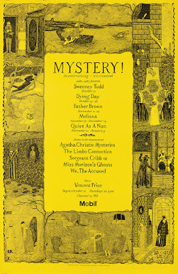
The back of a piece of artwork often tells its own story and the back of this piece is no exception. Like most artists, Edward Gorey occasionally exhibited a frugal streak when it came to reusing papers and boards. For this piece, he chose a board on which he had begun to block out a poster design for Mystery! The board has been cut down for this project, but the divisions for the vignettes are clearly indicated and the beginnings of a decorative border has been sketched in on the lower right.This poster design would be used for several seasons of Mystery! with the central block of type changing for each season.


No comments:
Post a Comment