Sunday, October 16, 2022

Edward Gorey's Magazine Covers Part 2 - The Full Color Covers


As discussed in the previous post, over the course of his career Edward Gorey created a total of 34 published magazine covers. Only 8 of the 34 covers were conceived as full color paintings, the rest being black and white drawings that sometimes had some color dropped in, or colored backgrounds added.  

In addition to the eight published color covers, there are also four unpublished full color designs.


Edward Gorey's first black & white magazine cover was published in 1950 by the Harvard Advocate, but it was not until the December 1971 issue of National Lampoon that a full color Gorey cover would appear. Unlike many of his previous black and white designs for other publications, this clever and amusing illustration lacks a bold visual appeal. The muted tones and block of small type appears fussy, and the dreary subject, while amusing, is not an endearing holiday image.   

The playful May 1975 Publishers Weekly cover is the boldest full color cover of the 1970's. With this cover, Edward Gorey hearkens back to his work for Anchor Publishing, and creates an illustration that incorporates all aspects of the magazine cover into a singular image. The masthead, logo, and typeface are reflected both in color and style on the wings of the flying figure, and the overall layout is conceived as a single Gorey-designed piece. The use of small speech bubbles would be more appropriate for an interior illustration than a cover image, but the design has a strong graphic sensibility. 

The June 1975 issue of National Lampoon has a better conceived cover image than the December 1971 Lampoon cover, but it still does not take full advantage of its prominent position. While Edward Gorey rarely used speech bubbles in his own work, he cannot seem to leave them off his color cover designs. Interestingly, the use of speech bubbles does not appear on any of his black and white magazine cover designs (see previous post for images).

1983's cover illustration for Radio Shack's Hot Coco magazine looks even more like a panel cartoon than the National Lampoon covers. This is mainly due to the artwork's placement on the cover, and the large speech bubble. With an Edwardian family discussing the merits of a color computer (CoCo stands for Color Computer), the image is colorful and humorous, but the layout of cover as a whole is pedestrian and unimaginative. The image itself is expertly rendered with painted details intermingling with line work to create different textures and surfaces. The use of color in this piece is subtle and quite beautiful.

Edward Gorey finally comes into his own with the June 1984 TWA Ambassador Magazine color cover. Titled The Insomniac's Garden, this piece is one of several "fantasy garden" images created by different artists that are featured within this issue. The drawing has been designed by Mr. Gorey as a complete concept, with room for the masthead and typography accommodated within the illustration. The design is bold, eye catching, and completely visual. Gone are the cartoon caption bubbles, leaving the viewer free to muse on the image. The piece is a subtle study in grey tones, with the occasional pinpoint of color to draw the eye.

Gracing the cover of the February 1988 issue of Print Magazine is another breakthrough design that fully celebrates Edward Gorey's talents as a magazine cover illustrator. The colorful painting explodes with imagination and Mr. Gorey's enigmatic visual humor. The image is accessible, yet delightfully puzzling.

In 1992 Edward Gorey submitted two full color pieces to The New Yorker for consideration, one of which was published as the cover of the December 1992 holiday issue. Papering the Tree would be the last color magazine cover by Mr. Gorey published during his lifetime. Once again, the artist has created a colorful, stimulating image that is full of humor. Instead of wrapping presents to put under the tree, this extended family is wrapping the tree itself - and the cat & dog.

Submitted to The New Yorker magazine in 1992 along with Wrapping The Tree, Cat Fancy was set aside by the editors to be virtually forgotten. Rediscovered many years after Edward Gorey's death, this masterpiece work would finally appear on the cover of the December 2018 holiday issue. Layers upon layers of fabric, pillows, dust ruffles, and duvets adorn an overstuffed bed whose inhabitants are a pair of reclining cats. 

Unpublished Cover Designs
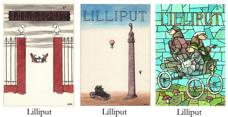
Gorey's earliest full color magazine covers were created for Lilliput Magazine, a British publication that combined humor with daring photos of unclad women. These paintings were created in the late 1940's/early 50's, and it is not known if these designs were actually submitted to the magazine for consideration. Each of these eye catching illustrations has well balanced images and a sophisticated use of color. The Lilliput designs were never published, and these three pieces of original art are in my personal collection.

Finally, along with the three Lilliput images from the 1950's, a fourth unused full color cover design was created by Edward Gorey in 1993. Flappers and Topiary is an imaginative image that, like Cat Fancy, was set aside by the staff at The New Yorker when it was submitted to the magazine in 1993. This image has yet to appear on the magazine's cover, but it was published as a full page memorial in the magazine shortly after Mr. Gorey's death.

Cover images provided by Irwin Terry, Sam Spiegel, Swann Auction Galleries, Internet Search


Friday, October 7, 2022

Magazine Covers


As a freelance illustrator, Edward Gorey created images for a wide variety of publications including books, newspapers, catalogs, and magazines. As early as 1950 Edward Gorey's artwork graced magazine covers, but they would not appear with any frequency over the course of his career. The sporadic nature of his cover appearances is likely because Mr. Gorey was primarily a book illustrator and that is where his energies were focused. While he produced hundreds of images for periodicals, Mr. Gorey created 34 images specifically for use as magazine covers. In addition, there were 5 images that were intended but never published as magazine covers. The relatively small number of Gorey designed magazine covers can be compared to Charles Addams, who created 64 covers for The New Yorker magazine during his career.  


These pictured groupings bring together all the known Gorey designed magazine covers (missing covers will be filled in as images turn up). Over the years, other images by Edward Gorey were hijacked and put onto the covers of magazines, but those images were not intended as cover designs so they have not been included here. 

Cover images provided by Irwin Terry, Sam Spiegel, Swann Auction Galleries, Russell Lehrer, Todd Camp, Internet Searches.


Tuesday, September 6, 2022

The Harvard Advocate Covers

It has long been stated that the cover of the September 1950 issue of The Harvard Advocate (HA) is the first Edward Gorey illustration to appear in a published work. However – while researching Mr. Gorey's periodical cover designs, I ran across the April 1, 2021 Ashcroft and Moore (A&M) auction listing for this particular magazine. The A&M auction sold the remnants of Andreas Brown's Gotham Book Mart inventory, and Lot 44 included a second, very seldom seen HA cover design by Mr. Gorey.


The September 1950 Registration issue is well documented and, while very rare, occasionally appears for sale. The 1950 Commencement issue is virtually unknown on the market. Looking at the titles of the two magazines, the natural assumption is that the registration issue was created/published first, and the commencement followed. Yet both are dated 1950; how can a publication that follows a single academic year have both issues published in the same calendar year? The answer lies within the magazines, on the Table of Contents pages. Fortunately, A&M scanned these pages and presented them as part of the auction listing.

The table of contents/information page in both copies states that the HA magazine was "Published six times a year in Sept., Nov., Dec., Feb., Mar., & May". The page in the Registration Issue clearly states that this is the September 1950 issue and is No. 1 (for the 1950/1951 academic year). The other issue does not specify the publication month, but says "COMMENCEMENT ISSUE, 1950, No. 6". This means it is the final issue of the 1949/1950 school year, and would have been published in May 1950; consequently making it the first published appearance of illustration work by Edward Gorey.

This is confirmed by the Volume numbers of CXXXIII in the Commencement, and CXXXIV in the Registration issues. It is also of interest that Edward Gorey is listed as Edward St. J. Gorey both issues.
 

Friday, August 26, 2022

Gorey Exhibition

The Cartoon Art Museum in San Francisco is presenting Gorey's Children, an ongoing exhibition or original artwork and limited edition prints by Edward Gorey. For more information on the museum and exhibit, go HERE.


Monday, August 1, 2022

Constructing and Painting an Edward Gorey Stage Set, Part 3 - Crosshatching Dracula

Edward Gorey's distinctive set designs for the 1973 Nantucket production of Dracula prompted an immediate discussion about transferring the show to Broadway. Whereas Edward Gorey's previous participation in set design had been in amateur and regional theater where he could be present, the construction and painting of the Broadway sets would be executed by a professional scene shop that was not under his personal day to day observation. This meant that his drawings needed to be precise and drawn to scale as the scene shop would construct the sets from the drawings and their notations.

On some of the drawings, Mr. Gorey added notes saying he did not know exactly what size something was supposed to be and hoped that would suffice. Today of course, texts and emails would be flying back and forth along with a snapshot showing the problem area(s), but this was a slower, more handmade time that relied on phone calls or sending actual artwork via couriers or through the mail.

The Nantucket Dracula sets had rooms and furnishings that were relatively life sized. For the New York stage at the Martin Beck Theater, the set would now be 30' across and 30' tall which required that the set components needed to be bigger and bolder while still taking the actors into consideration.

The sets for both productions were completely hand painted and one of the main stumbling blocks was enlarging Edward Gorey's distinctive drawing style to stage proportions while maintaining the integrity of the linework. Mr. Gorey combined three basic drawing styles for the sets to represent various materials and atmospheres - precise crosshatching, organic line work, and watercolor wash.

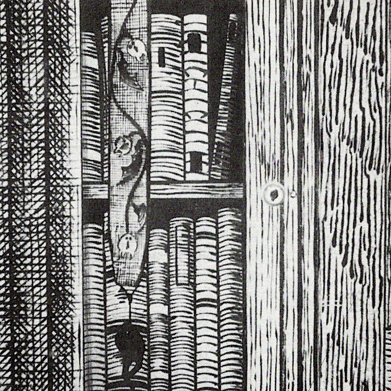
This bookcase set detail (Broadway production) illustrates all these techniques combined together. The "stone" column on the left is densely and precisely crosshatched, the wooden bookcase frame, section of paneling, and the books show several styles of organic line work, and the bell pull is watercolor washed so it looked like embroidered fabric. It should be noted that much of the set had a wash applied after the line work was completed to soften and tone the look of the set.

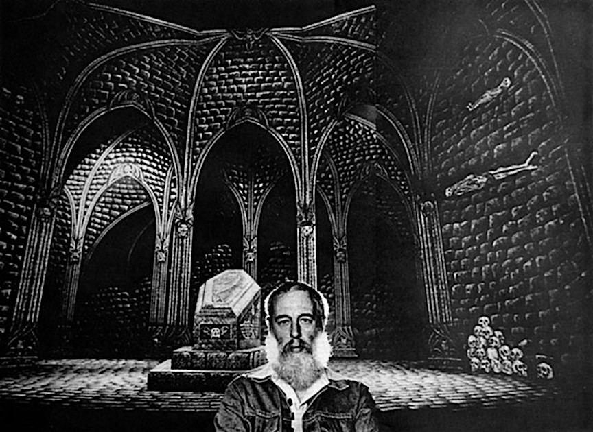
In the above photo, the top image is Edward Gorey's original artwork and the lower photo is the Broadway set with actor Raul Julia in the title role. The realized sets are masterfully painted and have the look and feel of the original artwork, but lack some of the spontaneity and density of Mr. Gorey's touch.

Producer John Wulp told Kevin McDermott (photographer, actor, producer, longtime Gotham Book Mart employee and friend of Edward Gorey) that the main stumbling block with the sets was to get the correct look for the crosshatching that Edward Gorey was famous for. After several unsuccessful attempts, a special tool was created that helped give the painted lines the correct look and feel. In the video below, my husband Bill and I have recreated the tool and filmed a short demonstration on how it would be used to paint the sets.


*Photographs showing Edward Gorey on the set of the original Broadway sets are by photographer Jack Mitchell. Photograph of Raul Julia on stage by Martha Swope (visit the New York Public Library Digital Collection for more photos - https://digitalcollections.nypl.org/search/index?utf8=%E2%9C%93&keywords=dracula+broadway). Set detail showing bookcase from Designing and Drawing for the Theater by Lynn Pecktal. Images of artwork from the Dracula Portfolio courtesy Russell Lehrer.

Tuesday, July 5, 2022

Constructing and Painting a Stage Set, Part 2

Edward Gorey's earliest documented design for a stage set piece is a panel used as the 1940 Christmas Concert backdrop at the Francis Parker School. The "stained glass window" depicts three rotund monks, drinking wine that is being distributed by a flying Putto. It is amusing and telling that 15 year old Edward chose to depict the excesses of the holiday season for a Christmas concert backdrop, and that his teachers went along with the idea. Titled Cum Beatitudinibus Bacchi in pencil on the left side of the drawing, the title can be generally translated as With The Blessings of Baccus.

The drawing has a grid drawn over the image that is ten squares wide and twenty squares high. The grid system is the simplest method of enlarging an image as each square can represent any measurement, so the artwork can be drawn at any size, gridded, and then enlarged or reduced in size.  

To enlarge this drawing, a 10 x 20 grid was drawn on the full size set piece. The artist, or team of artists (presumably Edward himself) then transfered what appears on the drawing to each corresponding grid square on the panel. In the school's yearbook photograph, the window appears to be about 10' tall, so in this instance each square would be be 6" x 6" and four squares together would be one square foot. 

After high school, Edward Gorey participated in other theatrical endeavors throughout college and beyond. Other than some poster and broadside designs, I have been unable to find any records of actual set designs until 1973 when he designed a production of Dracula at the Cyrus Pierce Theater in Nantucket. 

There are only three known surviving drawings of set pieces from the Nantucket production of Dracula - the drop curtain, proscenium arch, and the back wall of arches. While the artwork is very precisely rendered, there is no indication of scale on these drawings, so it is unclear if these pieces were drawn to an exact enlargement scale to fit the stage or, like the high school window design, a grid system was used to enlarge the artwork.

This production was produced by John Wulp and directed by Dennis Rosa, who seems to have had mixed memories of the production. Carol Verberg (author, friend, and producer of many Edward Gorey production on Cape Cod in the 1990's) related a chance encounter with Dennis Rosa on a bus in San Francisco some years after his collaborations with Mr. Gorey on Dracula.

Ms. Verberg relates that when asked about the Dracula sets, Mr. Rosa stated that "Edward didn't "design" the set for Dracula, he just did the drawings, which an under-credited underling transformed into a functioning 3-D set design."
We can take this statement with a dose of salt as John Wulp spoke highly of Edward Gorey's involvement in the production. No doubt, Mr. Gorey was not fluent in stage design and needed to work with and be coached by an experienced set designer/constructor. 

Some years ago, I chatted with John Wulp over the phone about the Dracula sets and asked why there are rugs on the stone floors in the Nantucket production but not in the Broadway incarnation. He said that they made the Gorey-designed rugs out of painted canvas and put them down, but that the actors were constantly being tripped up by them, so they decided to leave the floor bare. In the photo above, you can see that the rug is rather thin and does not lay flat.
Next post: More on painting the Dracula sets.

Tuesday, June 28, 2022

Constructing and Painting an Edward Gorey Theater Set, Part 1


Designing and Drawing for the Theatre by Lynn Pecktal (McGraw-Hill, 1995) is a textbook on the practical application of professional set design and construction, focusing on the New York theater scene. The book is an worthwhile read for anyone with an interest in how theatrical sets are conceived and executed. The book is also a time capsule of the time period and includes in depth interviews with several award winning stage designers.

The 1976 Broadway production of Dracula is featured with several double page spreads and additional spot illustrations showing the technical aspects involved in creating the sets for the production. Pecktal was scenery supervisor for the show. Unfortunately, Edward Gorey was not interviewed, but the photographs of the set being constructed offer a backstage view of the production. 

Viewing the information in this book got me ruminating on the process of transferring Mr. Gorey's scale drawings into functioning three dimensional theater sets. This began an informal search to collect stories from individuals who were directly involved in Gorey-designed stage productions. Forthcoming posts will explore how Edward Gorey's set designs were transferred from page to stage.

I would like to acknowledge fellow Gorey collector and enthusiast Todd Camp for bringing Designing and Drawing for the Theatre to my attention through one of his informative Instagram posts on Gorey ephemera.